Client:
Bynock printing limited
Scope of works:
Key Visual, Typographic
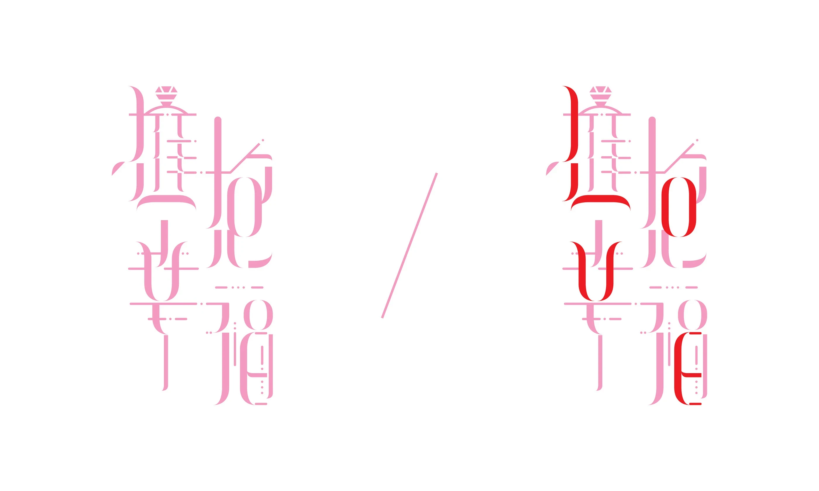
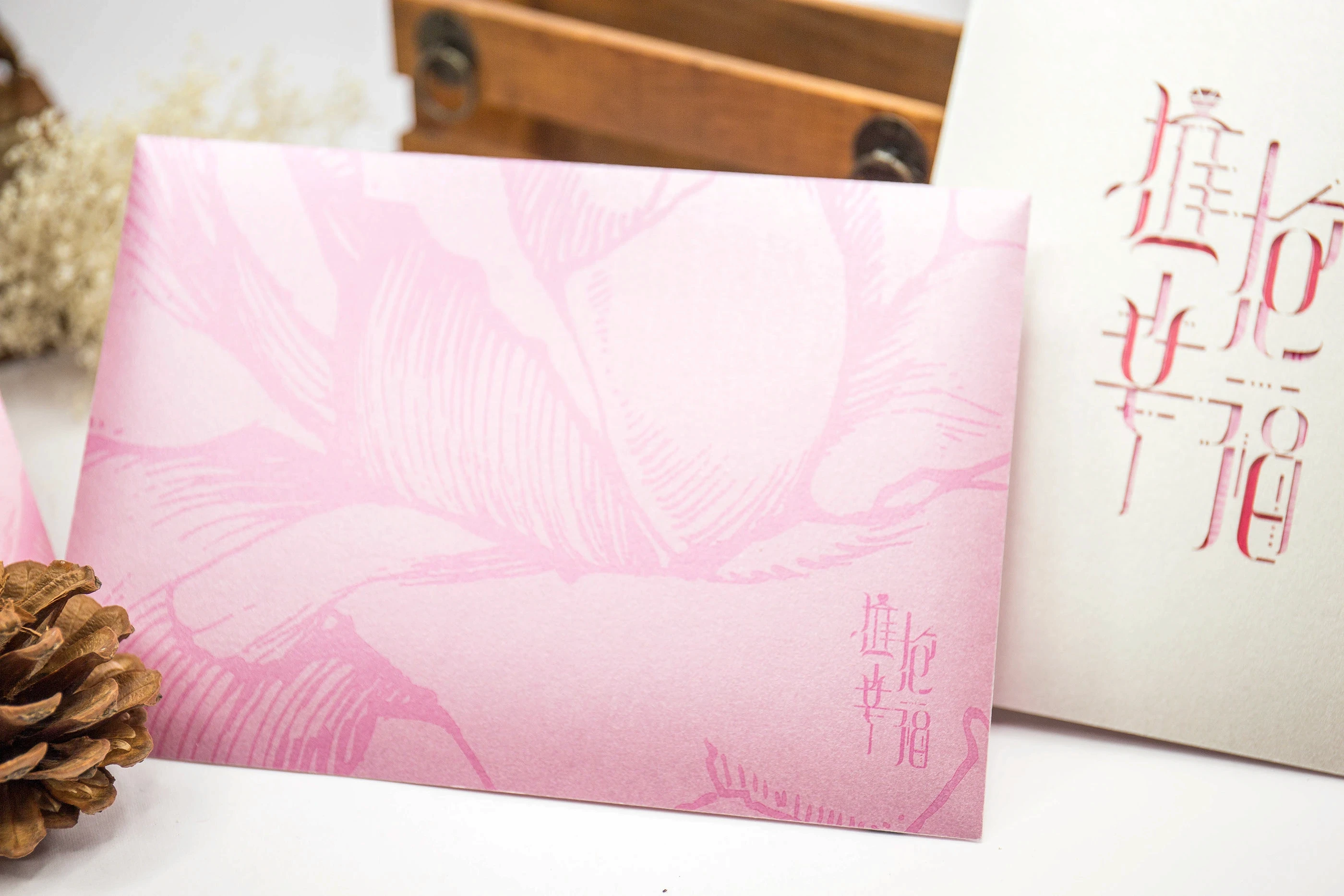
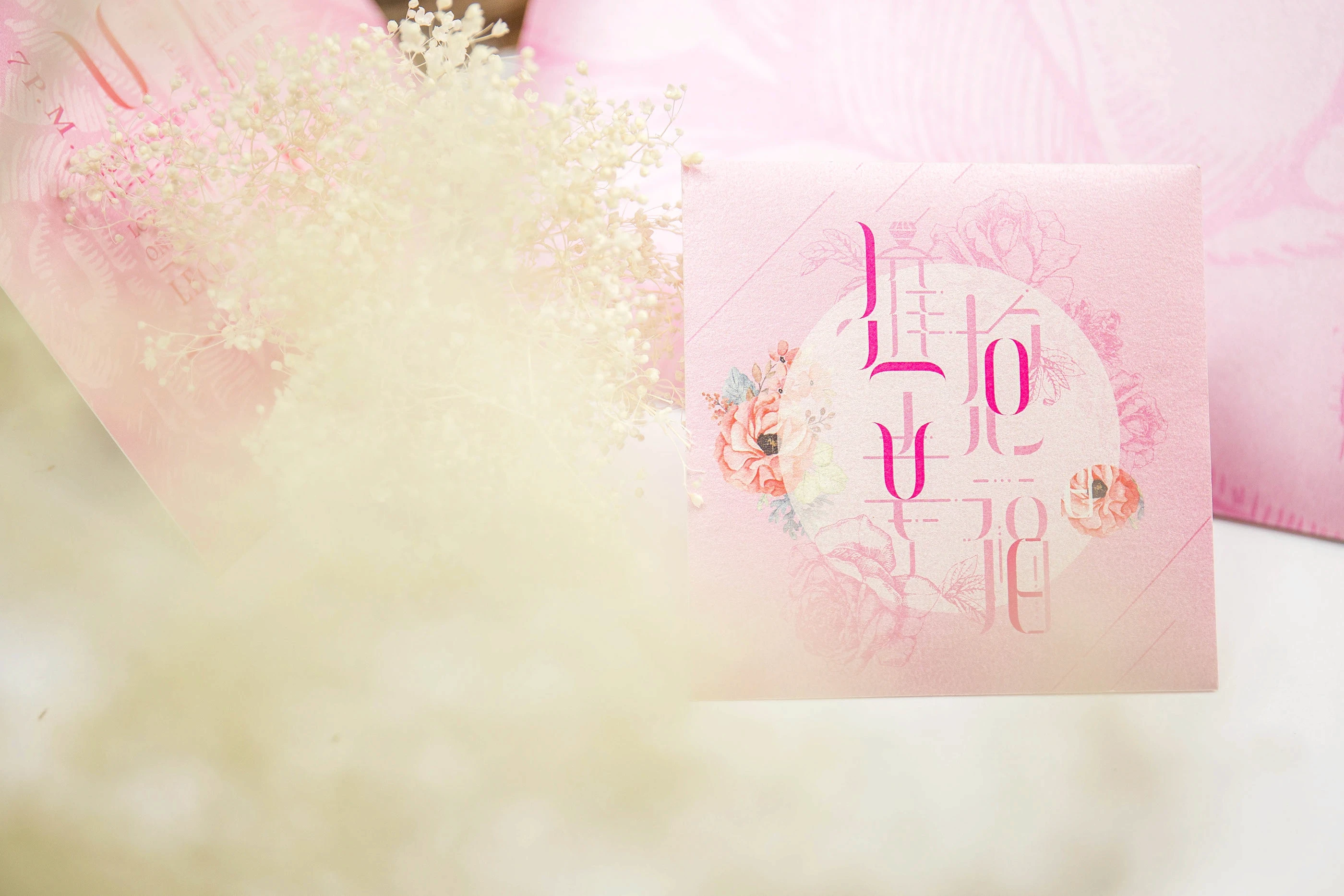
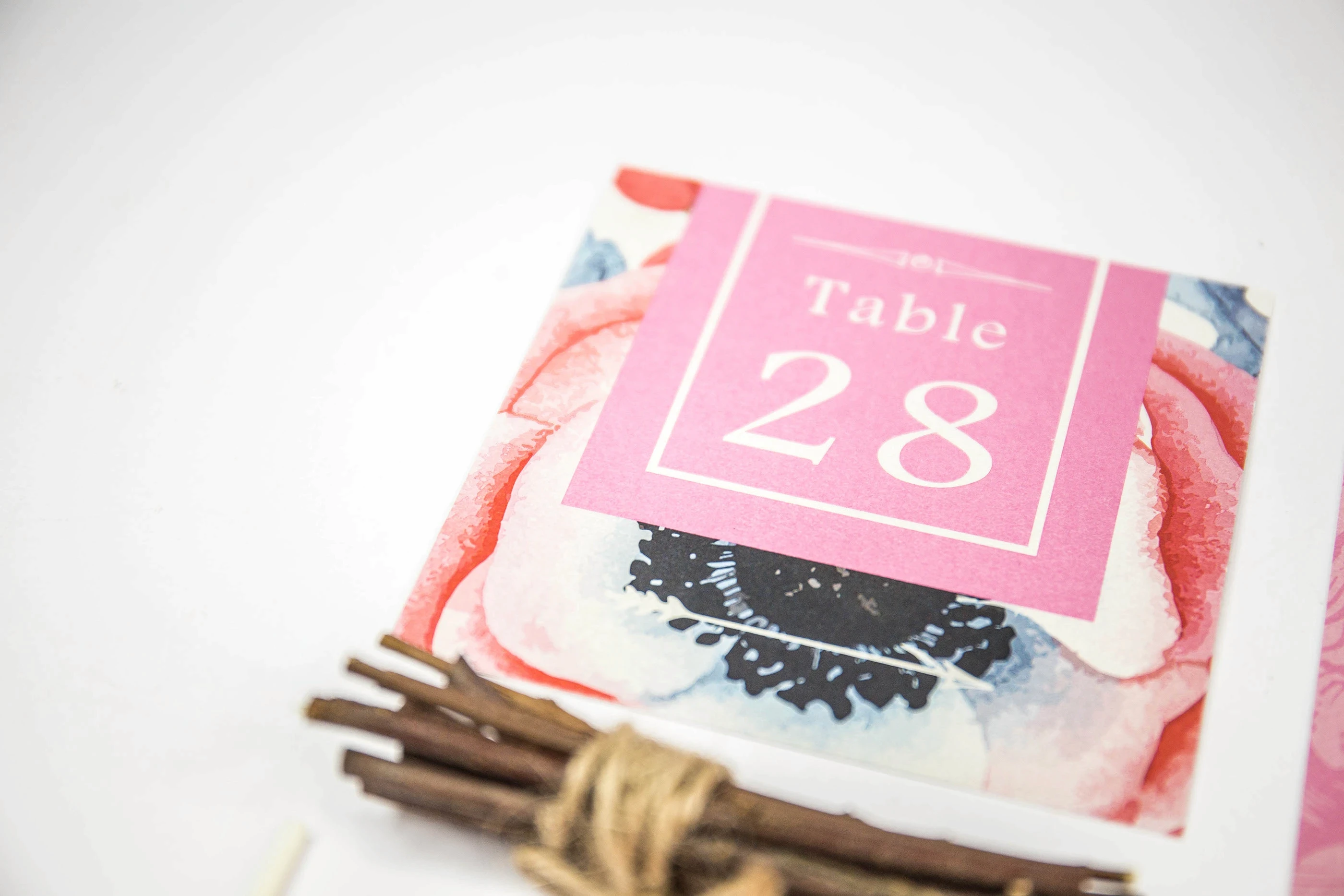
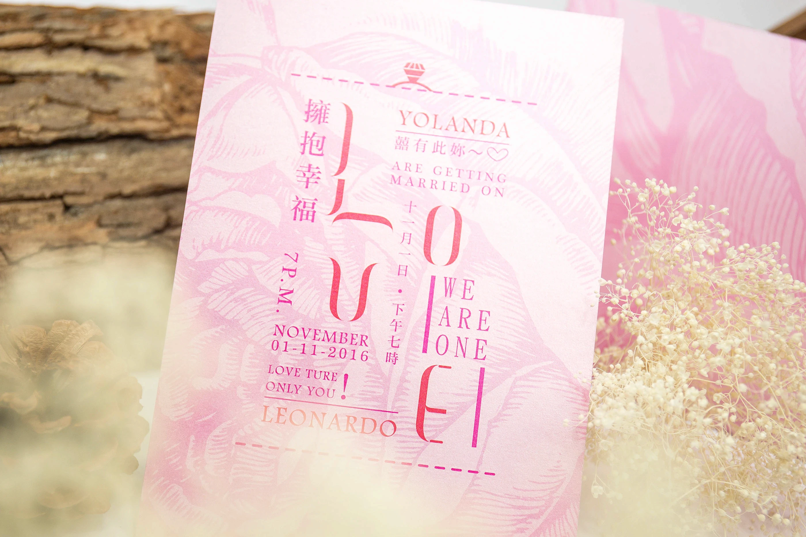
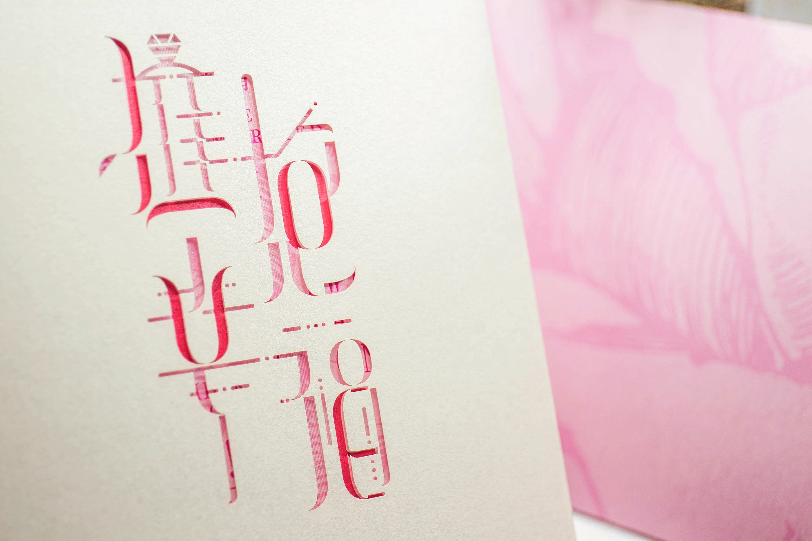
Developed a bespoke visual identity and stationery set for a wedding celebration, centred around an expressive Chinese typographic composition. The design combines traditional character forms with a contemporary editorial treatment, using layered strokes, subtle graphic details and a soft pink palette to create a romantic yet distinctive visual language. The identity was extended across the wedding materials to give the entire set a consistent and personal character.
Imapct:
The customised typography gave the wedding set a recognisable focal point that felt more personal than a conventional decorative motif. By applying the same visual language across different items, the design created a cohesive experience from the first invitation to the wedding-day materials. The balance of elegant typography, delicate colour and tactile printing details also helped elevate the stationery into a meaningful keepsake for the couple and their guests.
Challenges:
The main challenge was to create a romantic design without relying on common wedding symbols or overly decorative styling. The Chinese characters needed to remain visually expressive while still being readable and meaningful. Another challenge was ensuring that the intricate typographic details could be reproduced clearly across different sizes, materials and printing methods, while maintaining consistency throughout the full stationery set.